Your Cart (0)


.png)

Feb
13
2026
A Closer Look at the MLS Jersey Drop
The 2026 Major League Soccer Season is quickly approaching! adidas and the 30 clubs have all dropped their latest kits for the 2026/27 season. When you take a look at the full line up of kits dropped one thing is certain, MLS doesn’t do simple and subtle. Every season seems like each club is dropping a more iconic and show stopping kit than the season before, and this season is certainly no different. Come with us to break down the kits dropped by every club and learn more about what you can look forward to seeing on the pitch this season!
Atlanta United
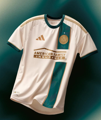
Unique, historic, a break from the pack. The 2026/27 Atlanta United Away jersey is perhaps one of their classically styled kits they’ve ever had. Paying homage to the ’96 games in Atlanta, the all-new away kit is clean, classic, and a step away from the typical ATL Away kit. Led with Green taking inspiration from the city’s canopy and highlights of gold and bronze to celebrate the Olympic games in the city, we get a unique and ready for action style.
Grade: 7.5/10
Austin FC
Subtle but sweet. The 2026/27 Austin FC Home Jersey celebrates the nature and landscape of the iconic Texas City. The “Rooted” kit uses a more subtle green compared to seasons past but it still offers that Austin sprit and style. Black finishings let the subtle Green shine, but tells the story of one of MLS’ newest clubs. The Rooted kit is perfect for off the pitch wear and match day support!
Grade: 7/10
Charlotte FC
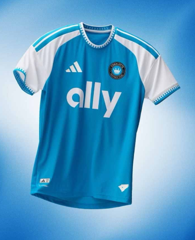
Celebrating the Queen city. The 2026/27 Charlotte FC Home Kit is very much steeped in club heritage and history. While they are one of MLS’ newest clubs, this kit definitely celebrates all things Charlotte. The Crowns up kit features royal detailing on the sleeves with blue spire trim that also makes its way to the the collar. For the crown sits on the back sign off and a two state lock up celebrates the connection between the two states their fans call home.
Grade: 6.5/10
Chicago Fire
Back to the basics. Chicago’s home kit is very much Fire-coded. With a return to a very classic and iconic red home kit design, fans of tradition certainly get that this season. While the kit is safe, it’s classic making it a perfect staple in a kit collector’s collection. While it’s nothing crazy, it’s very much Chicago.
Grade: 6/10
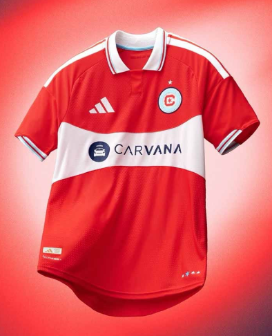
CF Montreal
The Procure jersey is more than just a kit, but a symbol of unity, strength, and a fight for more than just football. Partnering with Procure, Montreal’s kit is looking to spread awareness and break the taboos of prostate cancer. While the kit carries a meaning more than just soccer, it’s bold, powerful, and striking design is pushing the boundaries of traditional kit design and bringing the club into the future.
Columbus Crew
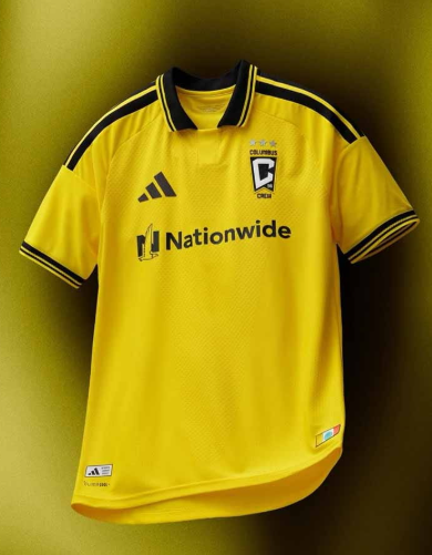
Bold. Classic. Crew. It’s a flashback to their beginnings with a clean and classic style. The 2026/27 Columbus Crew Home jersey gives fans and players a more historic look on the pitch, but the story and dominance is definitely in the details. With a sign off paying homage to their humble beginnings and the city’s iconic flag, we get history and class in one sweet kit.
Grade: 7/10
Colorado Rapids
The Colorful Colorado kit is here and celebrating the state the club calls home. While the jersey isn’t all out bold and exciting, the details and story are truly what makes this kit unique. The collar uses subtle colors to symbolize the natural elements that have made the state so iconic, from the red rocks to the mountains to the rapids, it’s very much Colorado.
Grade: 5/10
D.C. United
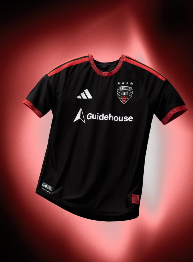
Traditional and trusted. D.C. United is one of the leagues most storied clubs and is bringing their history to every pitch they play on. The Black-and-Red kit is tried and trusted by the club, but this season’s feels a little different. Subtle detailing throughout the kit embodies the pride and spirit of the club without offering too many distractions.
Grade: 6/10
FC Cincinnati
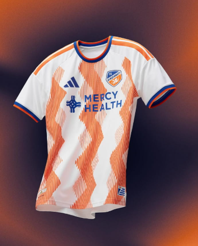
A symbol of the city, FC Cincinnati brings us the Seven Hills Kit for the 2026/27 season. Celebrating the city they call home and the club’s perseverance and resilience, the kit is a reminder of the the strength of one of MLS’ most dominant clubs. The club has never done something so exciting and offers a little piece of the city when they hit the pitch away from their stadium. This may be one of the club’s most exciting kits to date.
Ranking: 8.5/10
FC Dallas
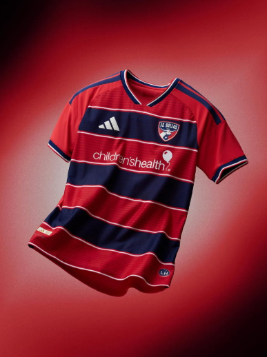
It’s the return of an icon. Hoops are officially back in Dallas’ 26/27 Home Kit. First unveiled by the club in 2005 and after a nearly decade long hiatus, the iconic hoops that have dominated the MLS are back and better than ever. Every aspect of the kit pays homage to the club whether it be in ownership, history, or home. Talk about a return to the classics with a modern new look.
Ranking: 8/10
Houston Dynamo
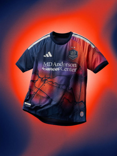
Celebrating the Space city, the Mission Control kit is one of the Houston Dynamo’s most dynamic and exciting kits they’ve had in years. Meant to see the details from orbit, we get a bold take and details that celebrate the map of the city while also celebrating Houston’s commitment to space and exploration. Orange waves pop throughout the jersey, meant to symbolize the passion and dominance from the club’s fans.
Ranking: 8/10
Inter Miami
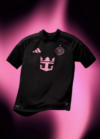
Classic, clean, a force to be reckoned with. Inter Miami’s Away kit is something we’ve seen before but with a more classic football inspired design. The Black jersey is complimented by details in the iconic Miami Pink that we have come to know and love. Lionel Messi’s squad is dawning their first ever star above the crest and what better way to do it than with a design that is built for one of MLS’ biggest squads.
Ranking: 6.5/10
LA Galaxy
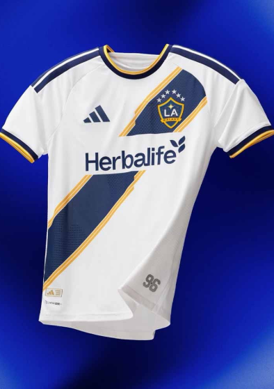
The sash is back! The Velocity is here and ready to celebrate the history of the club and city that they play for. Known for this iconic look since the club’s inception, LA Galaxy brought it back with a modern style. The Navy Sash uses the clubs gold for detailing and a break from tradition. All of this sits on the classic white base that is clean, simple, and classic – perfect for the Galaxy. While the kit isn’t a revolution, it’s classic just like the club.
Ranking: 5/10
LAFC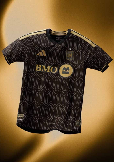
Art Deco meets on pitch dominance in the Black & Gold Kit. Nothing says LAFC like black and gold in a bold print. The kit takes inspiration of the city’s architecture from the 1920s and 1930s for a kit that screams Los Angeles. The details of the kit are just as iconic with Los Angeles carefully woven into the back neck and overhead view of BMO stadium on the the jock tag, bringing the city to the forefront.
Ranking: 9/10
Minnesota United
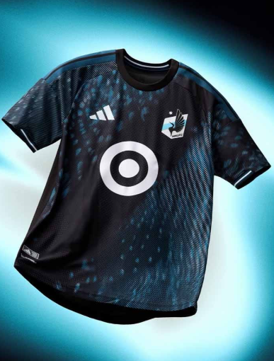
One decade down, many more to go. Minnesota United is celebrating 10 years of MLS action with a kit that takes pieces of history and molds them into one bold kit. Once the new kids on the block, the Loons are bringing the house down with an alternate kit that is dark, dominant, and demanding. The dark kit uses a rippling pattern across the kit, reimagining the look of a loon’s wing with a cut across black sash to pay tribute to the club’s inaugural season kit. The abstract kit a combination of state DNA and club history, perfect for a decade of dominance.
Ranking: 7.5/10
Nashville SC
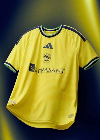
Reimagining the energy and vibe of the city, Nashville’s 2026/27 Home Jersey celebrates the music city in a bold and abstract way. Bringing back their bold yellow home style, the Reverb kit uses subtle details as a nods to radio broadcasting, where the sound of every match and moment is sent over the airwaves. Subtle blue and black details make the kit pop with a reimagined look on a kit that has been iconic since the club’s inception.
Ranking: 5/10
New England Revolution
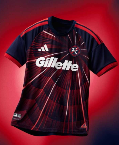
History meets nostalgia in the Revs all new kit. The Independence Day kit celebrates an iconic day for the United States that most notably took shape in Boston, where the New England Revolution call home. With an 4th of July-national anthem steeped look, we get Patriotism and dominance for the club that has been a staple in the league since its inception. The explosive design is a total break from the safe kits we’ve seen the revs sport with a style that is dominant and patriotic all at once.
Ranking: 8.5/10
New York City FC
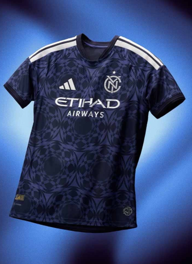
Many backgrounds. Many stories. One City. The All Nations kit celebrates the kaleidoscope of cultures and people that live in New York City. Meshing the flag and crest of the city with bold style, we get a kit that is 100% NYCFC. The muted blue top uses a kaleidoscope overlay to celebrate the city’s flag and the multitude of cultures that live in the city and rep the club. Talk about iconic.
Ranking: 7/10
New York Red Bulls
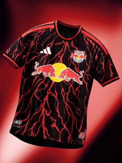
The Rooted Kit celebrates the culture, connection, and purpose of the club with a kit that is rooted in the Burroughs of the city. NYRB’s latest kit is anything but subtle, just like the club. Red Runs deep is the phrase that has been iconic and dominant for the club and the kit pays homage to just that with details on the sign off and a kit that gives us Stranger Things vibes!
Ranking: 7.5/10
Orlando City
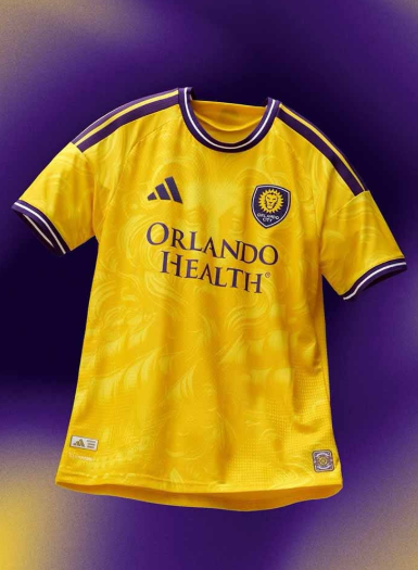
Going for gold. Orlando City is taking a new direction when it comes to their away kit and it’s one of their boldest looks yet. The Sunken Treasure kit takes a deep dive into Florida’s storied coastline and pirate-filled history. Inspired by exploration, shipwrecks, and the hunt for gold the kit is a huge break from tradition. A Gold Doubloon inspired sign off rests on the neckline while the gold jersey uses a pirate inspired overlay to give it an extra bold look.
Ranking: 6.5/10
Philadelphia Union
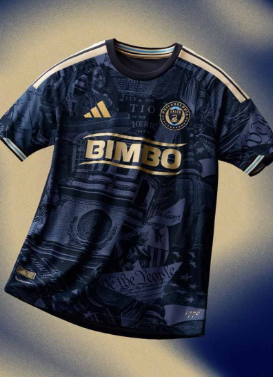
Celebrating 250 years of independence. Philadelphia’s all new home kit celebrates the founding of the United States in their home city with an incredibly bold and exciting kit. The navy kit uses details from the city, the declaration of independence, and constitution to celebrate the 250th birthday of America.
Ranking: 9.5/10
Portland Timbers
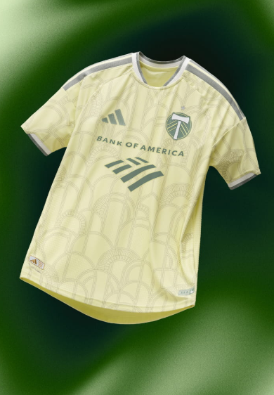
Embodying 100 years of history and dominance into a kit, the Civic Stadium Kit pays tribute to the stadium and city that has propelled the club forward. With a subtle yellow base, it’s the details that really tell the story in the kit. Subtle green archways sit throughout the entirety of the kit, paying tribute to Multnomah Civic stadium where soccer really saw it’s emergence in the United States.
Ranking: 6/10
Real Salt Lake
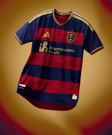
Reimagining a classic. The Switchback kit is a take on the club’s classic hoops but with details taking the kit over the top. Sitting within the stripes of the kit are Utah’s iconic Mountains and switchbacks, paying tribute to their home, while bringing back an iconic fit. Celebrating the Kings of Utah, the kit features details paying homage to their start and their reign as one of Major League Soccer’s top clubs.
Ranking: 6/10
San Diego FC
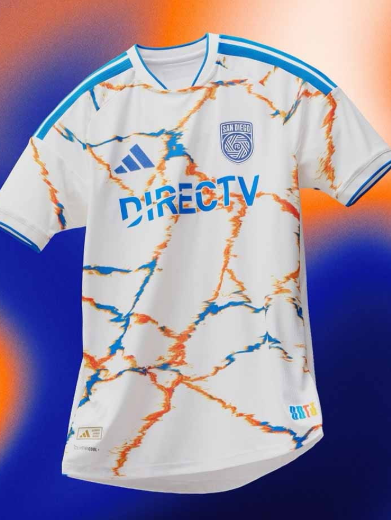
MLS’ newest club is bringing the energy to the pitch this season in their all new away kit. The Unprecedented Unity kit celebrates the city and cultures that are part of the club. “Sin Fronteras” sits on the neckline, celebrating the club’s diverse community and ability to break borders. The kit pushes the boundaries of style and design with a white kit that uses the club’s orange and blue to create a kit that tells a story with every stitch.
Ranking: 7.5/10
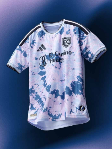
San Jose Earthquakes
Mixing music, culture, and community the Dead Kit celebrates one of the Bay Area’s most iconic groups. In partnership with the Grateful Dead, San Jose is sporting a tie dye kit that is both bold and steeped in music tradition. The kit breaks away from what we know and uses an artistic design that reps the Bay Area in style.
Seattle Sounders FC
A tribute to the evergreen state. The 2026/27 Seattle Home jersey takes a step back from the bold home kits of the past and tells the story of the state they call home. Rave Green works with finishings in blue, inspired by the coastline, forests, and iconic waterways of Washington state. All three club colors are present on the kits, each telling a story from the club and their home. While not as bold as we’ve seen in years prior, the kit tells a story unlike any other.
Ranking: 7/10
Sporting Kansas City
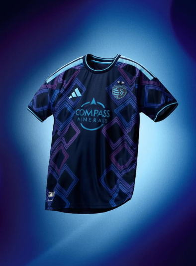
You like jazz? The Sporting KC Away Kit celebrates the rhythm and sporting blues that has draped that city for decades. Paying tribute to 18th and Vine, the kit is one of the club’s most exciting and electric they’ve had in years. Reimagining Argyle, the club’s signature kit design, with the style of Jazz and the city its hard to say anything negative about the kit.
Ranking: 9.5/10
St. Louis City
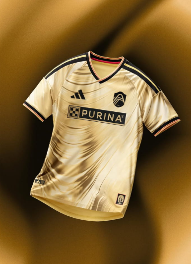
Energy, energy, and more energy. When you’ve got a kit designed to pay tribute to icon Tina Turner, we expect nothing less than energy and a bold look. The Eternal kit uses an exciting bold kit to pay tribute to the Queen of Rock ‘n Roll. Details that pay homage to Tina, like a lower sign off and dark waves that pay tribute to the icons iconic look, style, and music. This kit is 100% ready to take on the season and put the club back to winning ways.
Ranking: 8.5/10
Toronto FC
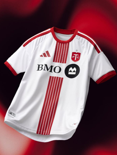
Cold and Crisp, the Toronto FC Winter Armour Kit is here! Embodying the snowy and ice cold climate, the kit embodies the spirit and style of the club and city with a kit that celebrates everything they’re known for and more. 6 stripes down the center of the kit celebrate the 6 city boroughs of the city while “ALL FOR ONE” sits on the sign off, celebrating 20 years of Toronto FC. Is this their coldest kit yet?
Ranking: 6.5/10
Vancouver White Caps
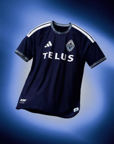
Going Coastal. Vancouver is known for the subtle yet classic style and this season is no different. The Coastal kit celebrates the iconic coastlines of Vancouver but in a subtle more classic style. The dark navy kit is very much Vancouver, but it’s the details on the sleeves and neckline that make this kit so iconic. White and blue peaks sit on the kit representing the coastal city and strength of the Pacific. Sign offs celebrate the city the club calls home while not detracting from the real star, the coastal elements.
Ranking: 8.5/10